integral to a special place.
Successful wayfinding systems put visitors at ease and, therefore, open to learning. Wayfinding can also reinforce the identity of a special place.
Historic treasures
From the 1930's when the zoo opened: neo deco architecture, carved WPA signs and cement sculptures, and whimsical maps.
From the 1930's when the zoo opened: neo deco architecture, carved WPA signs and cement sculptures, and whimsical maps.


Old maps
The tradition of marvelous maps continued into the 1960's.


Visitor testing
A series of tests in the 1980's informed decisions about directional signs.
Updated wayfinding


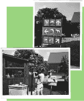
Directional signs picked up carving motif and colors, added stripes.


The color palette and animals illustrated in "neo-deco" style are among the elements used to develop a harmonious identity for the zoo.


| Exhibit design concepts | • Case study of design responding to a concept |
Websites | Illustrations | Advent Calendars | Logos | Print | Signs and exhibits
![]()

